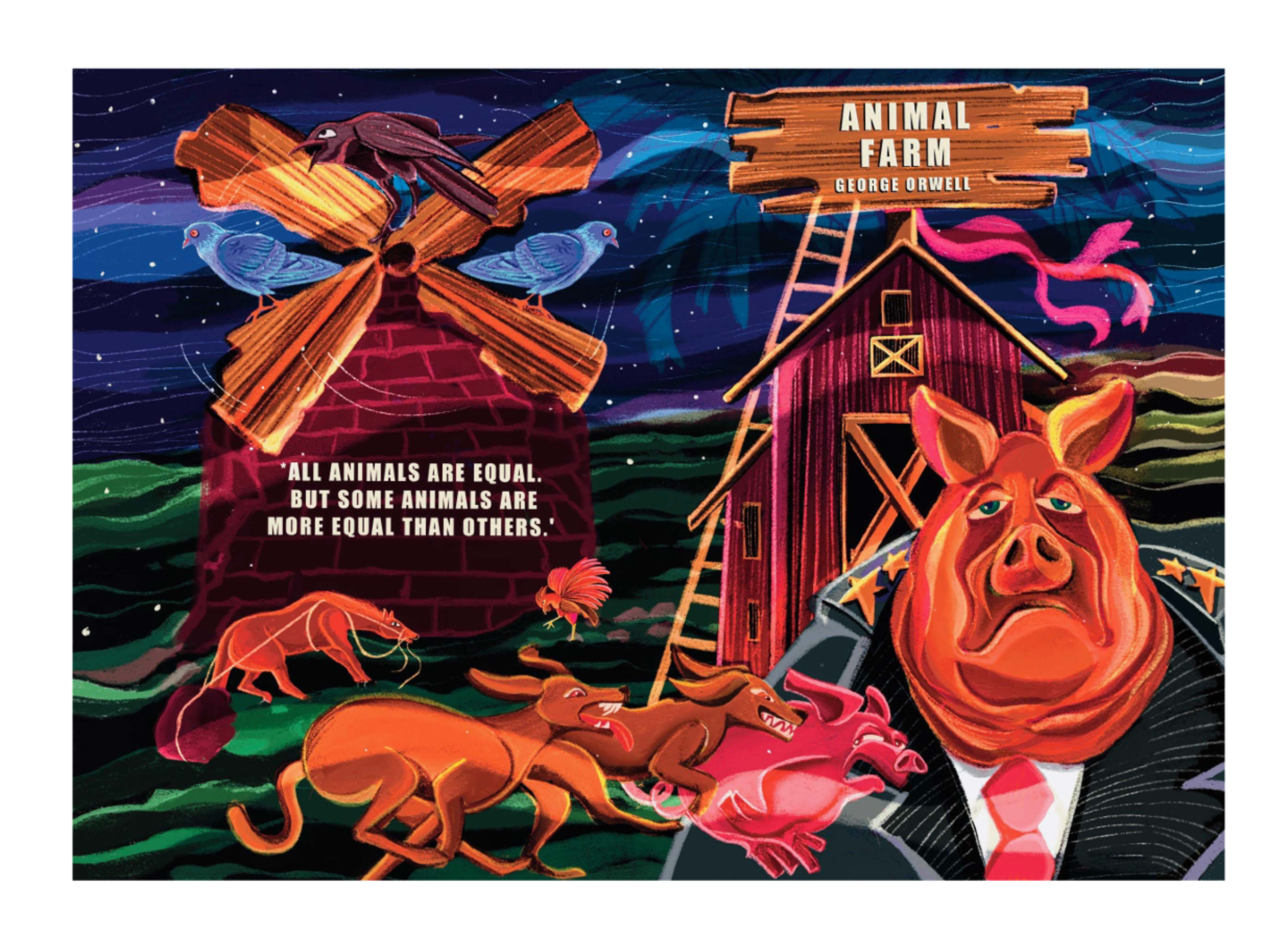
Animal Farm Book Cover Design
When I first read Animal Farm, I was struck by how cleverly Orwell used animals to reflect human behavior.
The story felt incredibly relatable—not because it mirrors today’s world directly, but because its concept is so unique and timeless. That’s what drew me in and inspired this cover redesign.
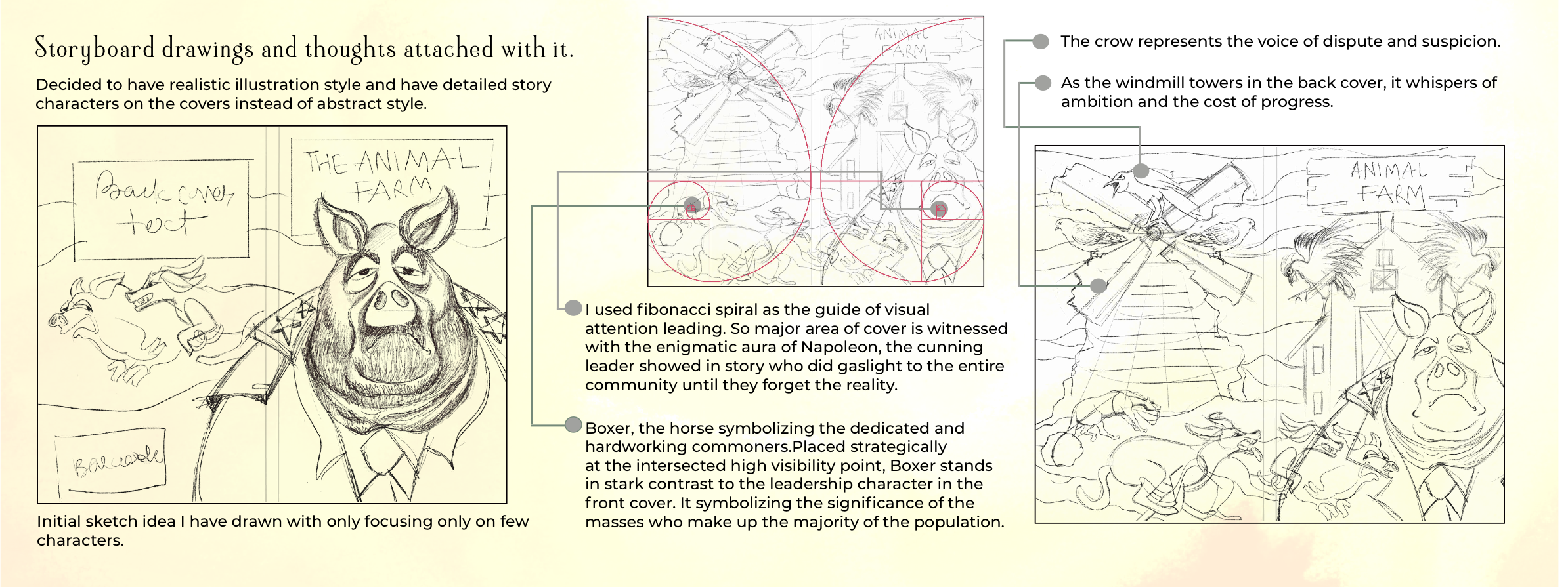
Fibonacci spiral concept + realism choice
To build the layout, I used the Fibonacci spiral as a guide to draw attention where it matters. This helped place each element meaningfully, not just visually but in terms of storytelling.
Boxer’s placement shows strength and sincerity, while Napoleon appears more secretive. The contrast between them adds tension. The windmill in the back talks about ambition, and the crow adds a layer of suspicion.
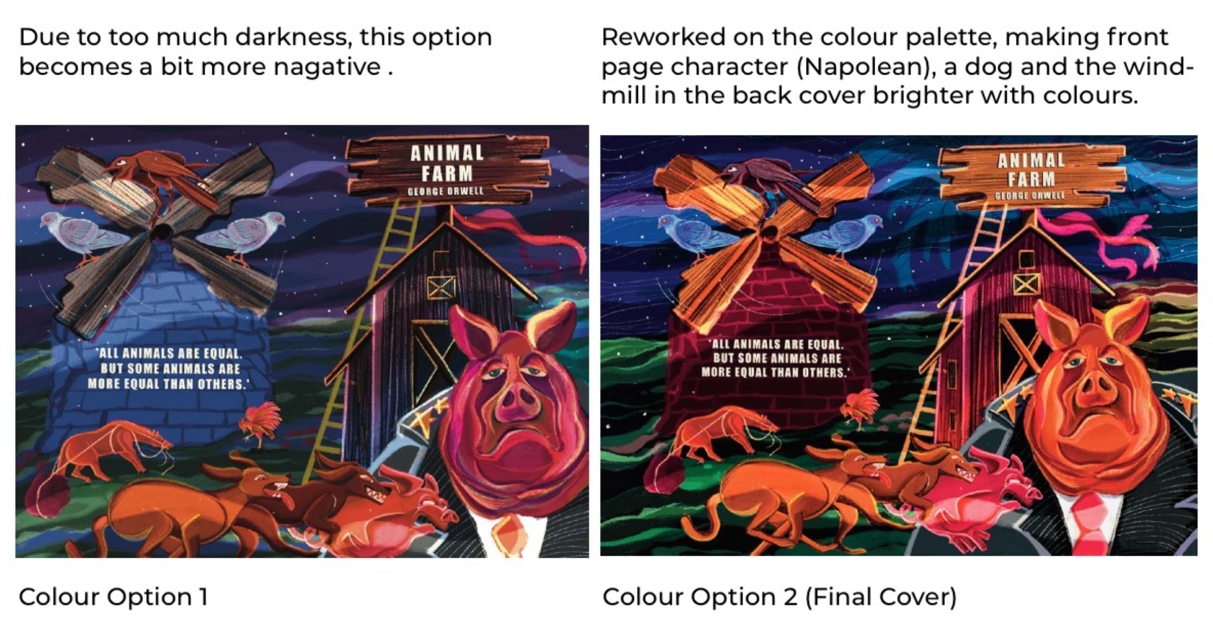
The color palette came from emotions I felt while reading the book. I wanted the mood to shift between fear, power, and hope without becoming too loud or too dull.

I tried different fonts and finally chose one that feels strong and direct. It doesn’t distract from the illustration but still adds a contemporary feel.

Before finalizing colors, I tested values using greyscale underpainting. It helped me control depth and balance before moving into full color.

The final composition aligns imagery, color, and type for a cover that’s haunting yet coherent—an invitation to reflect on both the story and its enduring themes.